Anyway, the company recently released the Meizu 17 Pro. And I got my hands on one. Now, rather than just doing a straightforward review, I thought I’d focus more on the design and user experience. Specifically, in a listicle format. You can’t stop me. HERE WE GO!
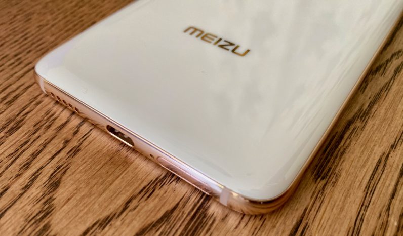
The ceramic sides of the Meizu 17 Pro are delicious
Not only do the ceramic sides of the Meizu 17 Pro look great, but I’m a sucker for how it feels while I’m using it. There’s just something extra premium about that design, the way it remains cool in your palm is reminiscent of a stone floor. God, I’m fancy. Also, the ceramic sides and back should make the phone better at withstanding falls.
I’m dig the color scheme
Over the past few years I’ve grown bored with phone makers finding endless ways to describe “blue” (aqua seabreeze), “green” (emerald forestscape), and a myriad of other bog standard standard colors. What I do like though is when phone makers put some nice colors together — especially when it’s the white and rose gold combination on the Meizu 17 Pro.
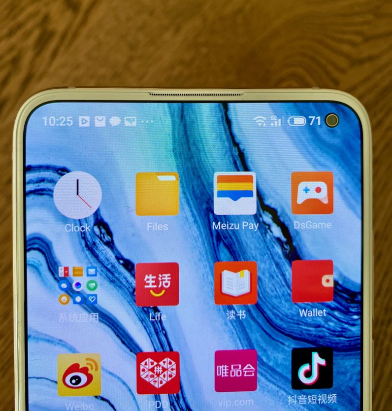
The hole-punch selfie camera is fantastically tiny
It’s a really great bit of engineering to get it so small. The hole-punch disappears into the screen in a way that makes it just look like another icon in the notification bar. Top marks.
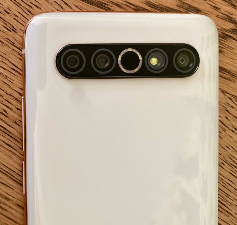
I also like the aesthetic of its camera array
The centralized camera spread has some retro-futurist style and, while I don’t think it’d work for every phone (I’d mock Apple if they released this), it works with the Meizu 17 Pro.
But… I don’t adore the pictures the Meizu 17 Pro takes
While the camera hardware is impressive on paper (a 64MP main, an 8MP telephoto, a 32MP ultrawide, and a time-of-flight sensor), it seems that the software behind it isn’t up to the same level as many other premium-labelled phones, like the Huawei P40. This isn’t to say the camera is bad, just that if taking pictures is important to you, there are better phones you can get for the $700 entry price. You know, like the Google Pixel 4. Anyway, here are two examples:
The software design and user experience isn’t up to standard
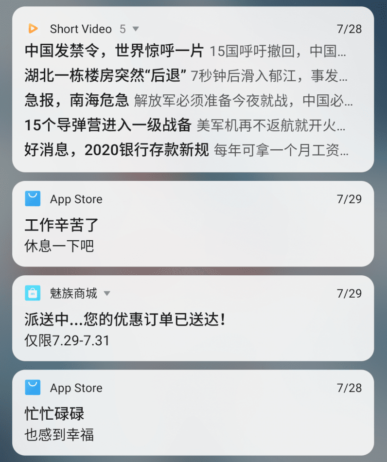
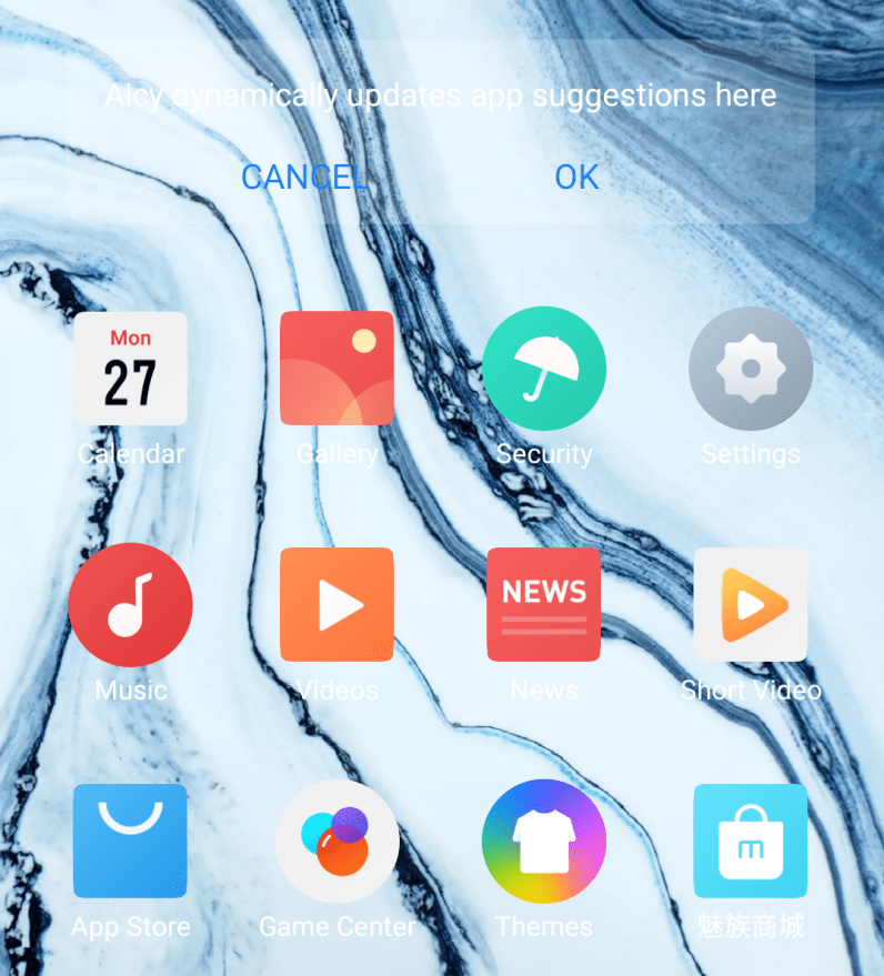
So, the Meizu 17 Pro uses Android 10 with the company’s own Flyme 8.1 over the top. And I really don’t like it. There’s no app tray, I’ve spent the past few days trying to update the phone with no success, there’s a whole load of bloatware and random apps installed, and a lot of the English translations are clumsy. Basically, it’s just not considered. For example, despite setting the language to English, my notifications constantly look like this: And the default theme makes it tricky to actually read what’s going on with the Home Screen without some serious squinting: Does it work? Yes, of course. But it doesn’t give the slick or minimal user experience I really want from “Pro” phones these days.
Conclude what you learned about the Meziu 17 Pro’s design
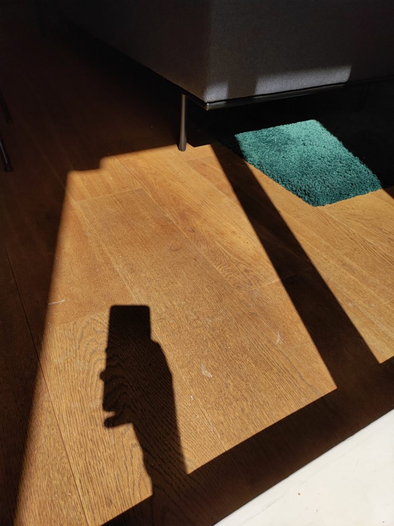
Hardware-wise, I think the Meizu 17 Pro shows elements of great design and is a pleasure to hold and use. It leaves a lot to be desired on the software front though. I could forgive this in a budget model, but for a $700 “Pro” phone? Nah, not for me. Anyway, I’ll leave you with a self portrait of phone that I liked:
